
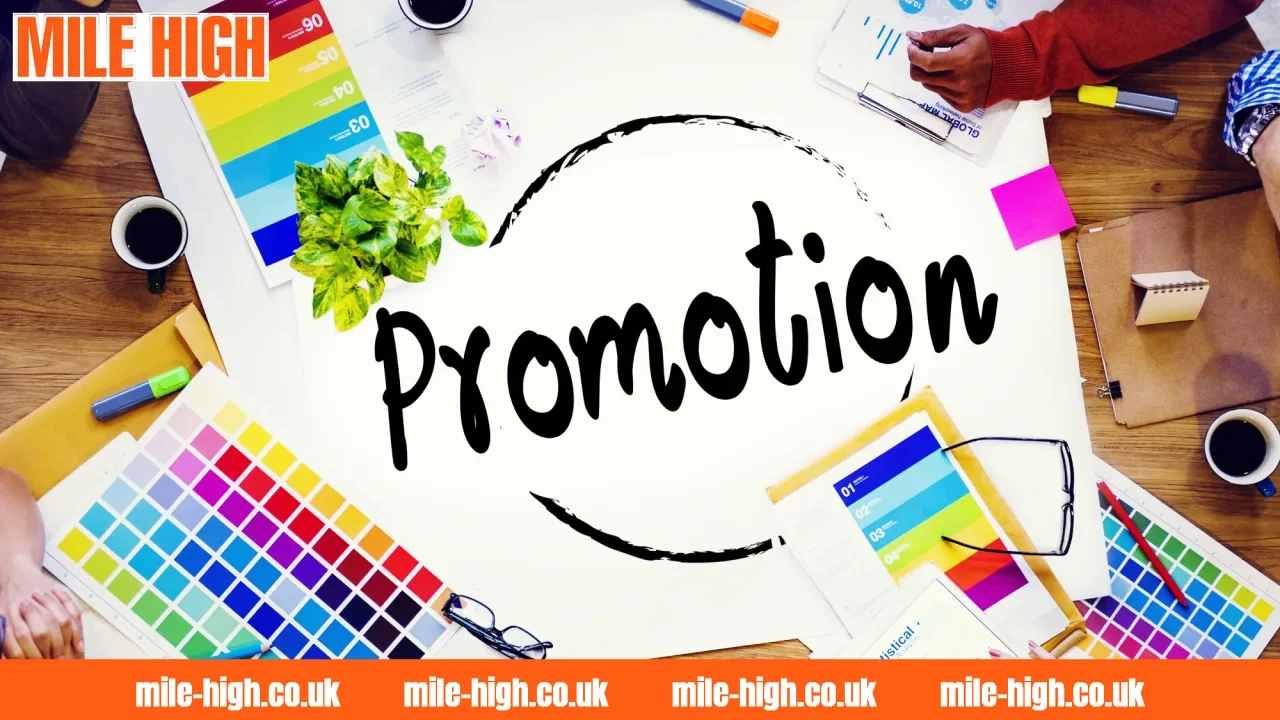
Promotional Images play an important role in shaping how audiences perceive a brand, product, or campaign at first glance. Beyond simply adding visual appeal, effective imagery can communicate ideas quickly, create emotional interest, and make promotional content easier to remember. Understanding the choices behind these visuals offers a clearer view of what makes promotional material truly stand out.
How Promotional Images Shape First Impressions

A strong visual can influence how audiences perceive promotional content before they read a single line of copy. Promotional images combine composition, color, subject matter, and messaging to communicate an idea quickly, making the first visual impression an important part of any campaign. Three key aspects below explain how visuals capture attention and turn an initial glance into genuine interest.
The Role of Visual Storytelling in Promotion
Visual storytelling allows promotional images to communicate context without relying entirely on written explanations. A carefully arranged image can suggest a lifestyle, highlight a product benefit, or establish a specific mood through its subject, background, framing, and visual hierarchy.
Elements That Make Promotional Images Stand Out
Several visual factors determine whether an image catches attention or simply blends into the surrounding content. Promotional images become more effective when their design elements support one clear message instead of competing for attention.
| Visual element | Impact on first impression |
|---|---|
| Composition | Directs attention toward the most important detail |
| Color | Establishes mood and strengthens visual recognition |
| Typography | Makes promotional messages easier to notice and understand |
| Focal point | Gives viewers an immediate visual destination |
| Brand elements | Helps audiences connect the image with a specific identity |
Using Images to Build Audience Interest
The strongest promotional images do more than present information; they create enough curiosity to encourage audiences to take the next step. A compelling visual can emphasize a key benefit, introduce an intriguing detail, or place the subject in a relatable situation that makes viewers want to discover more.
Relevance also plays a major role in maintaining attention. Visuals that reflect current design trends, familiar experiences, or the interests of a specific audience can feel more natural and engaging. When an image communicates both what is being promoted and why it deserves attention, the journey from a quick glance to genuine interest becomes much more seamless.
What Makes Promotional Images Effective
Effective visuals are not simply about making an advertisement look attractive; they need to communicate the right message to the right audience without creating unnecessary friction. Promotional images work best when design decisions, brand identity, and content quality support the same objective. The following factors help explain why some visuals feel instantly convincing while others struggle to hold attention.
Design Choices That Influence Viewer Response
Design choices directly affect how audiences interpret promotional images and decide whether to keep looking. Composition, contrast, spacing, typography, and image hierarchy should guide attention naturally toward the most important information rather than forcing viewers to search for the main point.
Platform requirements also matter because the same creative may perform differently across formats. An image designed for a mobile feed needs to remain understandable on a relatively small screen, while a website banner can accommodate a wider visual arrangement. Keeping the main message clear and limiting unnecessary elements can make the creative easier to absorb within a few seconds.
Matching Visual Content With Brand Identity
Consistency helps promotional images become recognizable even before audiences read the brand name. Using a coherent combination of colors, typography, imagery style, tone, and recurring visual elements creates a stronger connection between individual campaigns and the wider brand identity.
This consistency should not mean making every image look identical. Instead, the visual language can remain recognizable while layouts and creative concepts change according to the campaign. When audiences repeatedly encounter the same underlying style, they can gradually associate those visual cues with the brand, strengthening familiarity and recall.
Common Mistakes That Weaken Promotional Impact
Even well-intentioned promotional images can lose their impact when too many messages compete within the same frame. Excessive text, weak visual hierarchy, low-quality imagery, inconsistent branding, and unclear calls to action can make an otherwise promising creative feel cluttered or difficult to understand.
Some common problems include:
- Overloaded layouts: Too many visual elements can make the main message difficult to identify.
- Weak contrast: Text or important details may disappear when foreground and background elements are too similar.
- Inconsistent branding: Random colors, fonts, or imagery can weaken recognition across a campaign.
- Generic visuals: Stock-like or irrelevant imagery may fail to create a meaningful connection with the target audience.
- Unclear messaging: If viewers cannot quickly understand what is being promoted, attention can disappear before the message lands.
From Visual Appeal to Lasting Audience Impact

Strong promotional images can do more than attract attention for a few seconds; they can influence how audiences remember a campaign, product, or brand afterward. The difference often comes from whether the visual creates a clear association, communicates a meaningful message, and feels consistent enough to remain recognizable across different touchpoints.
A memorable visual does not necessarily need to be complex or heavily edited. Even a simple creative can leave a stronger impression when its imagery, message, and emotional tone work together naturally. For example, incorporating a recognizable reference such as Mile High can add context and help audiences connect the visual with a particular identity or setting.
Ultimately, effective promotional content should move beyond the initial “looks good” reaction. When promotional images combine visual clarity with relevance and a distinctive creative direction, they have greater potential to encourage engagement, strengthen recall, and remain memorable after the campaign itself has passed.
Conclusion
Strong Promotional Images are not defined by attractive visuals alone, but by how effectively they connect design, message, and audience expectations. When visual elements are carefully aligned with the intended identity and purpose, they can turn a simple promotional asset into a more memorable communication tool with lasting impact.